General Application Structure
ElyOS built-in system applications (Settings, Users, Log, Notifications, etc.) follow a unified structure that makes navigation and usage easier. This guide presents the general structure and operation of these applications.
Note: ElyOS is a modular system that allows the installation of custom applications and plugins. These applications can have completely different structures, with their own user interface and operational logic.
However, this guide also provides direction for designing custom applications. If you follow this structure, the application will integrate seamlessly into the system, provide a unified user experience, and you can save a lot of time - you can use ready-made components from the core system (sidebar, search, menu management, function bar), so you don’t have to build these features from scratch. Of course, if a custom solution is needed, there is complete freedom to create your own interface.
General Structure
Section titled “General Structure”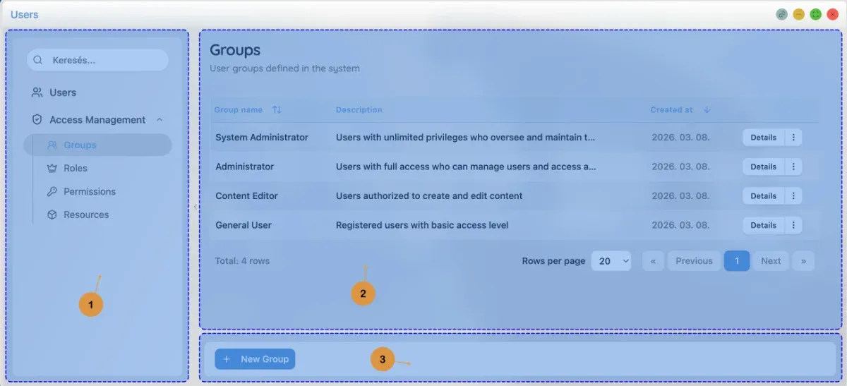 Users application structure
Built-in system applications consist of three main parts:
- Left sidebar - Navigation menu and search
- Right content area - Content of the active menu item
- Function bar (optional) - Action buttons below the content
Left Sidebar
Section titled “Left Sidebar”The left sidebar contains the application’s navigation menu and optionally the search function.
Navigation Menu
Section titled “Navigation Menu”The left sidebar contains the application’s navigation menu, which displays available functions in a hierarchical structure.
Menu characteristics:
- Menu items: Clickable elements that load different views
- Submenus: Some menu items contain additional submenus (expandable/collapsible)
- Icons: Each menu item has an icon for easier identification
- Active menu item: The currently open menu item is highlighted
- Permissions: Only menu items that the user has permission for are visible
Example menu structure (Users application):
👥 Users🛡️ Access Management ├─ 👥 Groups ├─ 👑 Roles ├─ 🔑 Permissions └─ 📦 ResourcesSearch in Menu
Section titled “Search in Menu”Some applications support search in the menu, which makes it easier to find the desired function in large menu structures.
Using search:
- Click on the search field at the top of the sidebar
- Start typing the name of the menu item you’re looking for
- The menu automatically filters based on the search term
- Click on the desired menu item to open it
Tip: Search ignores case and also finds partial matches.
Collapsing Sidebar
Section titled “Collapsing Sidebar”The sidebar can be collapsed with a button on its right edge, which provides more space for the content area.
Operation:
- Click the arrow button on the right edge of the sidebar to collapse
- In collapsed state, the button appears with a left-pointing arrow
- Click the button again to expand the sidebar
- The sidebar state (collapsed/expanded) is automatically saved, so it persists when reopening the application
Tip: Collapsing the sidebar can be useful on smaller screens or if you need more space to view content.
Right Content Area
Section titled “Right Content Area”The right content area displays the content of the active menu item. The nature of the content completely depends on the application’s function - it can be simple text information, complex interactive interface, or anything else the application requires.
Common content types in built-in applications:
- List view: Tabular data display (e.g., list of users)
- Detail view: Detailed data of an item (e.g., user data)
- Settings page: Configuration options (e.g., theme settings)
- Form: Data entry interface (e.g., creating new user)
- Other: Any custom content required by the application
Title Bar
Section titled “Title Bar”At the top of the content area is the title bar, which contains:
- Title: Name of the current view (e.g., “Users”, “Settings”)
- Description: Brief description of the view’s function (optional)
- Back button: Navigate back to list view in detail views (optional)
Function Bar
Section titled “Function Bar”The function bar appears at the bottom of the content area and contains actions related to the current view.
Function bar characteristics:
- Context-dependent: Buttons adapt to the current view and state
- Dynamic: Button appearance and function can change (e.g., in edit mode)
- Icon buttons: Each button has an icon and text label
Common Actions
Section titled “Common Actions”In view mode:
- Edit: Activate edit mode
- Delete: Delete item (with confirmation)
- Other actions: Application-specific actions (e.g., deactivate, export)
In edit mode:
- Save: Save changes
- Cancel: Cancel editing, discard changes
Example: User details function bar
In view mode:
- Edit button (pencil icon)
- Delete button (red, X icon)
- Deactivate/Activate button (ban/check icon)
In edit mode:
- Cancel button (X icon)
- Save button (check icon)
Edit Mode
Section titled “Edit Mode”Many applications support inline editing, which allows data modification without navigating to a separate edit page.
Edit mode characteristics:
- Activation: Click the “Edit” button on the function bar
- Fields: Data fields become editable input fields
- Editing related data: Remove button (X) appears next to badges
- Adding new items: ”+” button appears to add new items (e.g., add new group)
- Save/Cancel: Function bar buttons change
Example: Editing user
In edit mode:
- Name, email, username fields become input fields
- X button appears next to group badges for removal
- ”+” button appears to add new group
- “Save” and “Cancel” buttons appear on the function bar
Confirmation Dialogs
Section titled “Confirmation Dialogs”For critical actions (delete, deactivate), a confirmation dialog appears.
Confirmation dialog characteristics:
- Title: Name of the action (e.g., “Deactivate user”)
- Description: Detailed description of the action and its consequences
- Confirm button: Execute the action (often red for dangerous actions)
- Cancel button: Cancel the action
Example: Deactivate user
Title: Deactivate userDescription: Are you sure you want to deactivate [Name] ([email])? Inactive users cannot log into the system.Buttons: [Cancel] [Deactivate]Notifications (Toast)
Section titled “Notifications (Toast)”Toast notifications inform about the results of actions.
Notification types:
- Success: Green, with check icon (e.g., “User successfully saved”)
- Error: Red, with X icon (e.g., “Error occurred during save”)
- Warning: Yellow, with warning icon
- Info: Blue, with info icon
Notification characteristics:
- Automatically disappear after a few seconds
- Appear in the top right corner
- Multiple notifications appear stacked
Permissions
Section titled “Permissions”Applications and menu items are permission-based.
Permission management:
- Menu items: Only menu items that the user has permission for are visible
- Actions: Some actions (e.g., edit, delete) are only accessible with appropriate permission
- Empty menu: If there is no permission for any menu item in an application, the application does not appear
Tips and Tricks
Section titled “Tips and Tricks”- Quick navigation: Use search in the menu for large applications
- Combining filters: Multiple filters can be used simultaneously in list views
- Sorting: Click column headers to change sorting
- Cancel editing: The “Cancel” button discards all changes
- Permissions: If you don’t see a menu item, request permission from the administrator
Related Topics
Section titled “Related Topics”- Applications overview - ElyOS built-in applications
- Users - Managing users
- Settings - System settings
- Log - System logs