Data Tables
Data tables are one of the most commonly used components in ElyOS. They display structured data in tabular format with sorting, filtering, and pagination features.
Where You’ll Find Data Tables
Section titled “Where You’ll Find Data Tables”Data tables appear in many applications:
- Users application: Lists of users, groups, roles, permissions
- Notifications application: List of notifications
- Log application: Error logs and system events list
Data Table Structure
Section titled “Data Table Structure”A data table consists of the following parts:
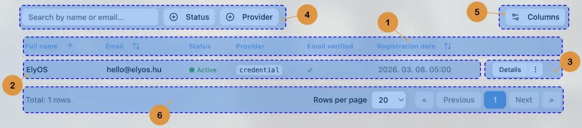 Data table structure and elements
1. Header
Section titled “1. Header”The header row at the top of the table contains column names. A sort icon often appears next to column names, indicating whether the column is sortable.
Sorting: Click a column name to sort:
- First click: Ascending order
- Second click: Descending order
- Third click: Clear sorting
2. Data Rows
Section titled “2. Data Rows”Table rows contain the actual data. Each row represents one item (e.g., a user, a notification).
3. Actions Column
Section titled “3. Actions Column”The actions column on the right side of the table contains actions for that row.
Single Action
Section titled “Single Action”If only one action is available, a simple button appears:
[ Open ]Multiple Actions - Primary Button + Dropdown
Section titled “Multiple Actions - Primary Button + Dropdown”If multiple actions are available, the most important (primary) action appears as a separate button, with other actions in a dropdown menu:
[ Open ] [⋮]- Primary button (left): Most frequently used action (e.g., “Open”, “Edit”)
- Dropdown button (right, 3 vertical dots): Additional actions menu
Usage:
- Click the primary button to execute the main action
- Click the 3-dot button to display additional options
- Select an action from the dropdown menu
Example actions:
- Open / Edit (primary)
- Activate / Deactivate
- Delete (usually marked in red)
4. Filters and Search
Section titled “4. Filters and Search”Many data tables have filtering options above the header:
- Search field: Text search through data
- Filter buttons: Predefined filters (e.g., “Active”, “Inactive”, “Critical”)
- Custom filters: Application-specific filtering options
5. Column Visibility
Section titled “5. Column Visibility”The “Columns” button in the top right corner of the table allows customizing column visibility:
- Click the “Columns” button (gear icon)
- Check or uncheck columns
- The table automatically updates
Note: Some columns (e.g., name, actions) cannot be hidden as they’re essential for table usage.
6. Pagination
Section titled “6. Pagination”The pagination bar at the bottom of the table allows browsing large datasets:
- Total row count: Visible on the left showing total items
- Rows per page: Selectable (usually 10, 20, 50, 100)
- Page numbers: Clickable page numbers for quick navigation
- Previous/Next buttons: Step through pages
Common Operations
Section titled “Common Operations”Opening an Item
Section titled “Opening an Item”- Find the desired item in the table
- Click the “Open” or “Edit” button in the actions column
- Item details appear
Deleting an Item
Section titled “Deleting an Item”- Find the item to delete
- Click the 3-dot button in the actions column
- Select the “Delete” option (usually marked in red)
- Confirm deletion in the confirmation window
Warning: Deletion is usually permanent and cannot be undone!
Sorting Data
Section titled “Sorting Data”- Click the column name in the header
- The table automatically sorts
- Sort direction (ascending/descending) is indicated by an arrow icon in the header
Filtering Data
Section titled “Filtering Data”- Use the search field for text search
- Click filter buttons to apply predefined filters
- The table automatically updates based on filter criteria
- Use the “Clear filters” button to restore the original state
Tips and Tricks
Section titled “Tips and Tricks”- Quick search: Start typing in the search field - the table filters immediately
- Combine multiple filters: Use search and filter buttons together for more precise results
- Customize columns: Hide unused columns for a cleaner appearance
- Increase page size: If you want to see many items at once, increase rows per page
Related Topics
Section titled “Related Topics”- Modal Windows - Confirmation windows for delete operations
- Toast Messages - Feedback on performed actions